Services
Rebranding
Packaging Design
Bar41
Bar41, an industry leader in premixed wine cocktails, approached us to assist in a significant market transition. With a well-established reputation amongst beer and wine licensees (Type 41 in California), Bar41 sought to bring their range of award-winning cocktails directly to consumers via retail stores.
The task was multifaceted: create a rebranding strategy and reimagine packaging design to engage the broader, ready-to-drink consumer market while retaining Bar41's unique brand essence.
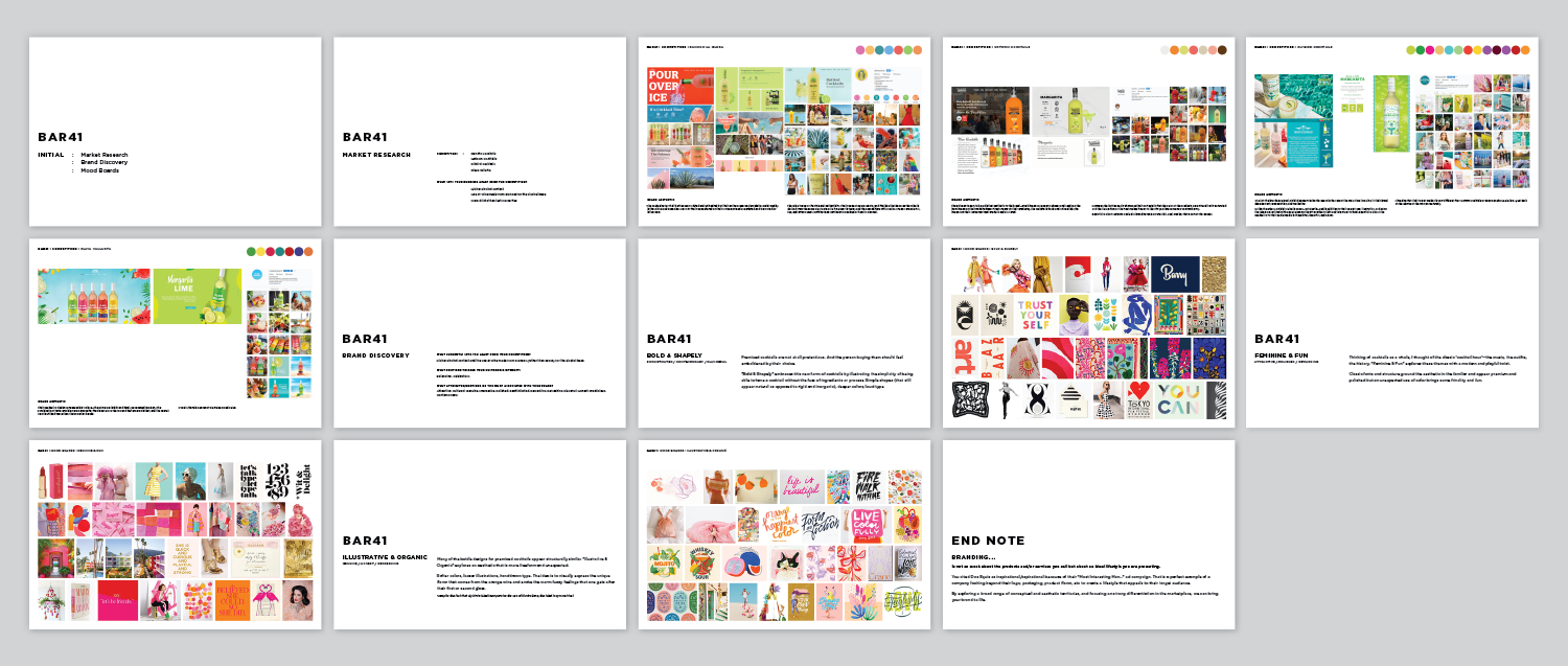
Determining the Brand direction
We began with a combination of interviews, surveys, and moodboards to determine brand equity and how to differentiate Bar41 from other ready-to-drink already at retail. This informed our work in developing the new logo and packaging design.
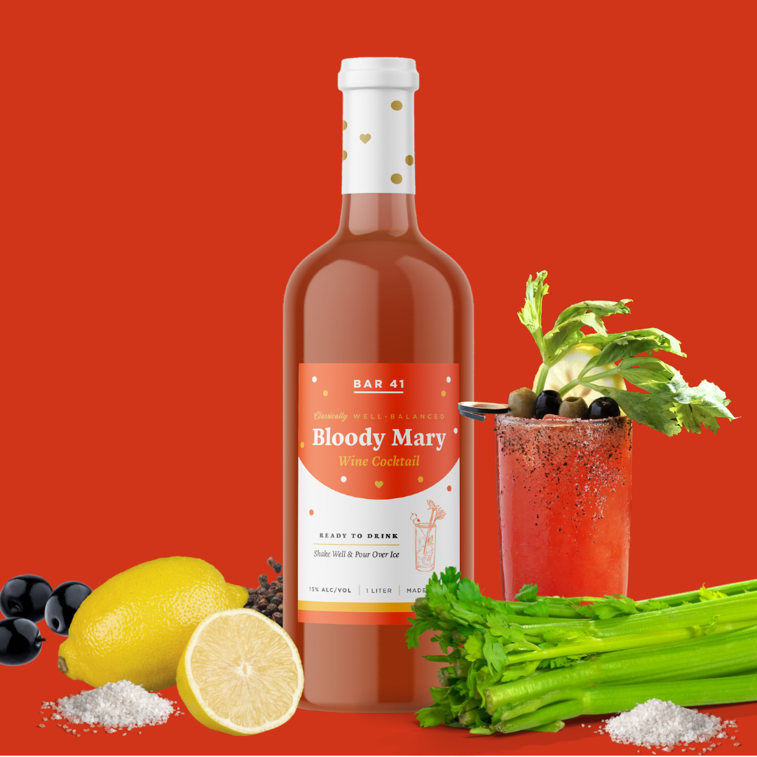
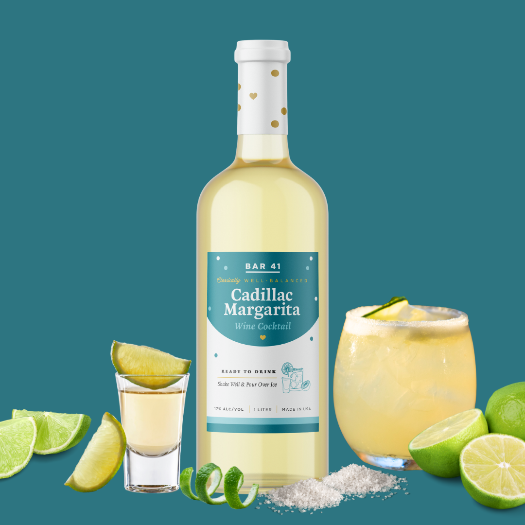
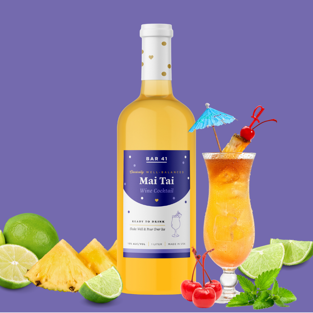
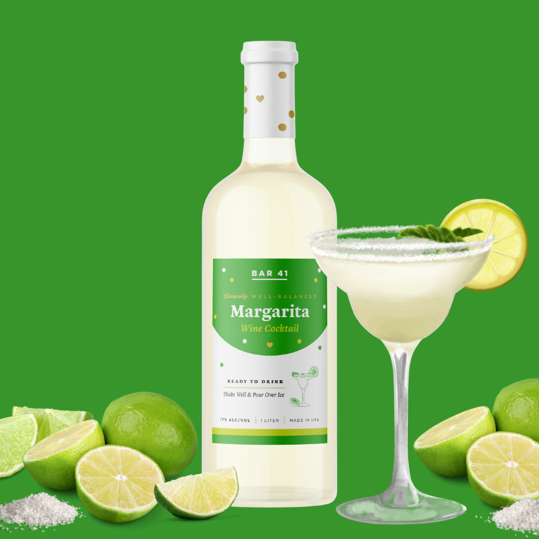
a Feminine & Festive Rebrand for the Retail Market
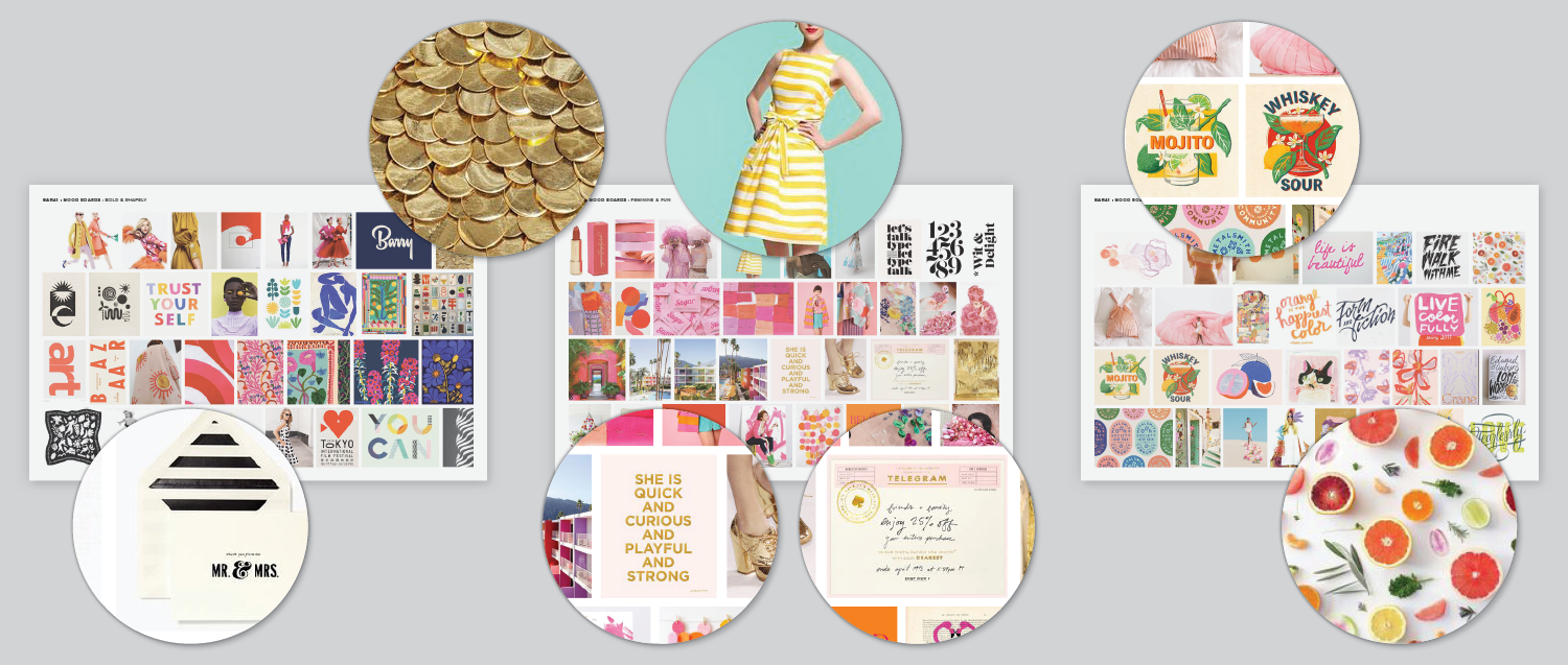
Our collaboration with Bar41 aimed to foster an emotional connection with their new consumer base. We sought to evoke feelings of belonging and celebration through our designs, elements intrinsic to the cocktail-drinking experience.
Each mood board encapsulated different aspects of the desired brand persona, visually representing potential design directions for Bar41. By curating imagery, color palettes, typography, and design elements that reflected these themes, we were able to explore and define the brand's evolving identity effectively.
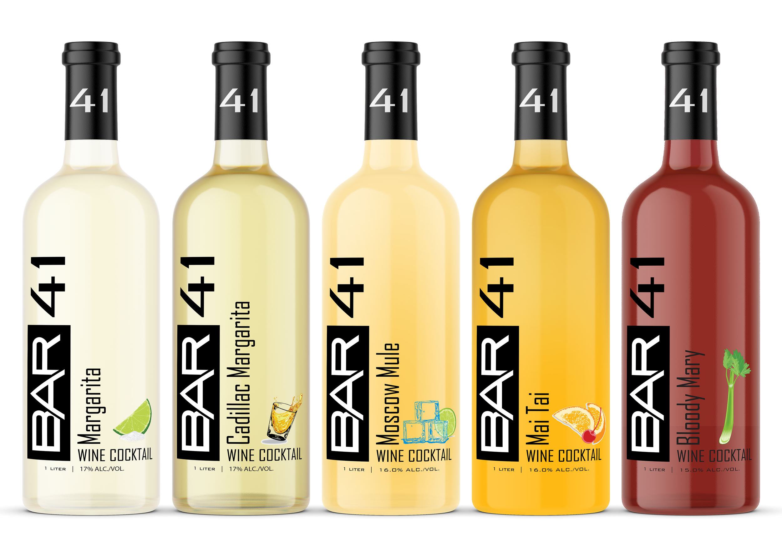
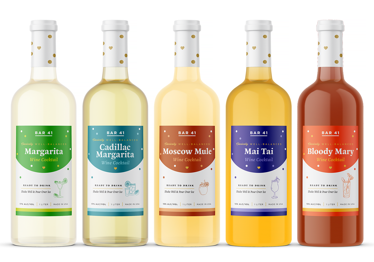
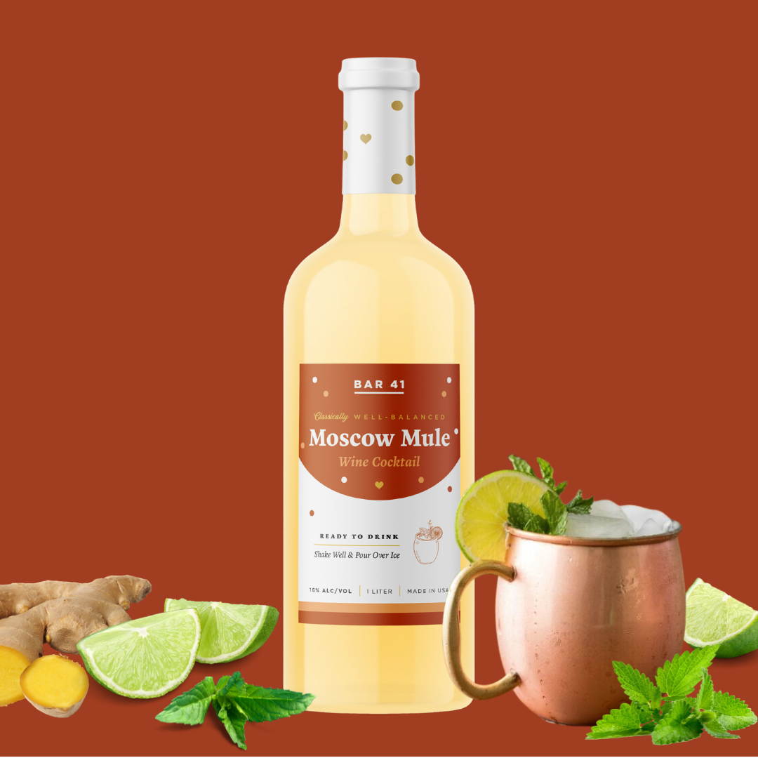
The new brand persona was infused with femininity and fun, resonating with the aesthetic sensibilities of their target audience and ensuring their range of award-winning cocktails–Margarita, Cadillac Margarita, Moscow Mule, Mai Tai, and Bloody Mary–remained attractive and relevant.